黑色主题h2
效果参考本站
black.stylh3
black主题参考官方的
cyberpunk.styl样式修改
再 themes/icarus/source/css/ 目录下添加一个black.styl 文件, 然后把下面的样式添加进去
/* DARK THEME DESIGN SYSTEM - WCAG 2.1 AA Compliant */
$theme-black ?= #1E222A$theme-dark-gray ?= #080E1D$theme-mid-gray ?= #2D2D2D$theme-light-gray ?= #3D3D3D
$theme-white ?= #FFFFFF$theme-light ?= #F0F0F0$theme-text ?= #E0E0E0$theme-dim ?= #B0B0B0
$accent-blue ?=rgb(255, 255, 255)$accent-purple ?= #BD8FE8$accent-green ?= #4AE58C$accent-yellow ?=rgba(0, 106, 255, 0.35)$accent-red ?= #FF5A76
$accent-blue-dark ?= #2A6D99$accent-purple-dark ?= #7A5E99$accent-green-dark ?= #287D4D$accent-yellow-dark ?= #B38F3F$accent-red-dark ?= #B23A4D
$primary ?= $accent-yellow$info ?= $accent-blue$success ?= $accent-green$warning ?= $accent-yellow$danger ?= $accent-red
$family-sans-serif ?= 'Oxanium', Ubuntu, Roboto, 'Open Sans', 'Microsoft YaHei', sans-serif$family-code ?= 'Roboto Mono', monospace, 'Microsoft YaHei'
$shadow-small ?= 0 2px 5px rgba(0, 0, 0, 0.5)$shadow-medium ?= 0 4px 10px rgba(0, 0, 0, 0.5)$shadow-large ?= 0 8px 20px rgba(0, 0, 0, 0.5)$shadow-card ?= 0 0 8px rgba(0, 0, 0, 0)
$radius ?= 0$radius-small ?= 0$radius-medium ?= 0$radius-large ?= 0
$white ?= $theme-black$white-bis ?= $theme-dark-gray$grey ?= $theme-dim$black ?= $theme-white$black-bis ?= $theme-light
$orange ?= $accent-yellow$yellow ?= $accent-yellow$green ?= $accent-green$blue ?= $accent-blue$purple ?= $accent-purple$red ?= $accent-red
$orange-invert ?= $theme-black$yellow-invert ?= $theme-black$green-invert ?= $theme-black$blue-invert ?= $theme-black$purple-invert ?= $theme-black$red-invert ?= $theme-black
$primary-invert ?= $theme-white$info-invert ?= $theme-black$success-invert ?= $theme-black$warning-invert ?= $theme-black$danger-invert ?= $theme-black
$scheme-main ?= $theme-black$link ?= $accent-blue$link-hover ?= lighten($accent-blue, 15%)$link-active ?= darken($accent-blue, 10%)$link-focus ?= $accent-blue$text ?= $theme-text$text-strong ?= $theme-light$text-light ?= $theme-dim
$body-background-color ?= $theme-black
$input-color ?= $theme-text$input-background-color ?= lighten($theme-black, 5%)$input-border-color ?= $theme-light-gray$input-placeholder-color ?= rgba($theme-dim, 0.8)$input-hover-border-color ?= $accent-blue$input-focus-border-color ?= $accent-blue
$footer-color ?= $theme-light$footer-background-color ?= #181C24
$navbar-background-color ?= #151824$navbar-item-color ?= $theme-light$navbar-item-active-color ?= $accent-blue$navbar-item-hover-color ?= $accent-blue$navbar-item-hover-background-color ?= rgba($theme-white, 0.05)
$card-background-color ?= transparent
$menu-label-color ?= $accent-white$menu-item-hover-color ?= $theme-white$menu-item-hover-background-color ?= $accent-yellow$menu-item-active-color ?= $theme-white$menu-item-active-background-color ?= $accent-yellow$menu-list-border-left ?= 1px solid $theme-light-gray
$tag-color ?= $theme-white$tag-background-color ?= $theme-mid-gray
$timeline-fg-line ?= $accent-yellow$timeline-bg-line ?= $body-background-color
$post-navigation-fg ?= $theme-text
$searchbox-bg-container ?= lighten($theme-black, 5%)$searchbox-border ?= $accent-blue$searchbox-bg-input ?= $theme-black$searchbox-bg-close-hover ?= $theme-mid-gray$searchbox-bg-close-active ?= lighten($theme-mid-gray, 10%)$searchbox-bg-result-item-hover ?= $theme-mid-gray
@import 'style'
undercover-before()    position: relative
    &:before        content: ''        position: absolute        z-index: -1        top: 0        left: 0        right: 0        bottom: 0
body    counter-reset: card    background: $theme-black
::selection    color: $theme-black    background: $accent-blue
.card:not(#back-to-top)    position: relative    counter-increment: card    transition: transform 0.2s ease, box-shadow 0.3s ease


    &, .card-content        background: $theme-dark-gray        position: relative        box-shadow: $shadow-card        transition: box-shadow 0.3s ease
        &:before            z-index: -1            top: 0            left: 0            right: 0            bottom: 0            transition: all 0.3s ease
    &:before        top: -1.2px        left: -1.2px        right: -1.2px        bottom: -1.2px        background-color: $accent-blue
    &:after        position: absolute        color: $accent-blue        right: 2rem        bottom: -.6em        font-size: .75rem        padding: 0 .25em        background: $body-background-color
    .card-content:before        background-color: $body-background-color

clip-button($color, $color-invert)    position: relative    transition: transform 0.2s ease
    &:before        background-color: $color        color: $color-invert        transition: background-color 0.2s ease, transform 0.2s ease
    &:hover, &.is-hovered        transform: translateY(-1px)
        &:before            background-color: lighten($color, 10%)            color: $color-invert
    &:focus, &.is-focused        &:before            box-shadow: 0 0 0 2px rgba($color, 0.5)            color: $color-invert
    &:active, &.is-active        transform: translateY(1px)
        &:before            background-color: darken($color, 5%)            color: $color-invert
    &[disabled], fieldset[disabled] &        opacity: 0.65
        &:before            background-color: desaturate($color, 20%)
    &.is-inverted        &:before            background-color: $color-invert            color: $color
            &:hover, &.is-hovered                background-color: darken($color-invert, 5%)
            &[disabled], fieldset[disabled] &                background-color: $color-invert                border-color: transparent                box-shadow: none                color: $color
.button:not(input)    border: none    outline: none    background: transparent !important    transition: transform 0.2s ease, box-shadow 0.2s ease


    &:focus:not(:active)        box-shadow: 0 0 0 2px rgba($accent-blue, 0.5)
    for $name, $pair in $colors        $color = $pair['1']        $color-invert = $pair['2']
        &.is-{$name}            clip-button($color, $color-invert)


.menu-list a    transition: background-color 0.2s ease, color 0.2s ease
    &:hover        transform: translateX(2px)
.tags.has-addons    .tag:first-child        background: $accent-yellow !important        color: $theme-white !important
    .tag:last-child        background: $accent-blue !important        color: $theme-black !important
.pagination-previous, .pagination-next, .pagination-link    outline: 1px solid $theme-light-gray    outline-offset: -2px    transition: background-color 0.2s ease, color 0.2s ease, transform 0.2s ease
    &:hover        background-color: $accent-blue        transform: translateY(-1px)
        &, a            color: $theme-black
    &:focus        box-shadow: 0 0 0 2px rgba($accent-blue, 0.5)
    &.is-current        background-color: $accent-blue        border-color: $accent-blue        color: $theme-black
.navbar-main    min-height: 4.25rem    box-shadow: $shadow-small    border-bottom: 1px solid rgba($theme-white, 0.1)
    &:after        content: ''        position: absolute        left: 0        right: 0
    .navbar-menu        .navbar-item            margin: 0 1px            transition: color 0.2s ease, background-color 0.2s ease            position: relative
            &:after                content: ''                position: absolute                bottom: 0                left: 50%                width: 0                height: 2px                background: $accent-blue                transition: width 0.3s ease, left 0.3s ease
            &:hover, &.is-active                color: $theme-white                background-color: rgba($theme-white, 0.05) !important
                &:after                    width: 100%                    left: 0
article.article, article.media
    .title a        background-image: linear-gradient(transparent calc(100% - 2px), $accent-yellow 2px)        background-repeat: no-repeat        background-size: 0 100%        transition: background-size 0.3s ease-in-out, color 0.2s ease
    .title:hover a        background-size: 100% 100%        color: $theme-white
article.article    .article-more        box-shadow: 0 0 0 1px $accent-blue        color: $theme-light        transition: background-color 0.2s ease, color 0.2s ease, box-shadow 0.2s ease
    .article-more:hover        color: $theme-white        background-color: $accent-blue        box-shadow: 0 0 0 1px $accent-blue, 0 4px 8px rgba($accent-blue, 0.3)
    .article-more:active        transform: translateY(1px)        box-shadow: 0 0 0 1px $accent-blue
.article-licensing    background: $theme-mid-gray    border-left: 3px solid $accent-blue
.content    blockquote        background: rgba($accent-blue, 0.05)        border: none        border-left: 4px solid $accent-blue        padding: 1rem        margin: 1.5rem 0        border-radius: 0 4px 4px 0
.footer    position: relative    border-top: 1px solid rgba($theme-light, 0.1)
    &:before        content: ''        position: absolute        left: 0        right: 0        top: -1px        height: 39px        opacity: 0.5.timeline .media:last-child:after    background: $theme-dark-gray
.timeline .media    &:before        clip-path: polygon(50% 0, 100% 50%, 50% 100%, 0 50%)        background: $accent-blue        transition: transform 0.3s ease, background-color 0.3s ease
    &:hover:before        transform: scale(1.2)        background: lighten($accent-blue, 10%)
.searchbox    background:rgba(255, 255, 255, 0.33)
.searchbox .searchbox-container    border: 1px solid $accent-blue    box-shadow: $shadow-medium    transition: box-shadow 0.3s ease
    &:focus-within        box-shadow: $shadow-large
    .searchbox-body        border-bottom: 1px solid $theme-light-gray
        li:last-child .searchbox-result-section            border-bottom: none
    .searchbox-result-item        transition: background-color 0.2s ease
        &:hover            background-color: $theme-mid-gray
        em            color: $theme-white            font-weight: bold            text-decoration: underline            text-decoration-color: $accent-yellow            text-decoration-thickness: 2px
#back-to-top    color: $theme-black    background: $accent-blue    margin-top: 45px    transition: background-color 0.2s ease, transform 0.3s ease    box-shadow: $shadow-medium
    &:hover        background: lighten($accent-blue, 10%)        transform: translateY(-3px)        box-shadow: $shadow-large
    &:active        transform: translateY(0)        box-shadow: $shadow-small
.cc-window, .cc-revoke    border-radius: 0 !important    box-shadow: $shadow-large
.cc-window    &:not(.cc-banner)        border: 1px solid $accent-blue
    &.cc-theme-classic, &.cc-theme-block        .cc-compliance > .cc-btn            border-radius: 0            transition: background-color 0.2s ease, transform 0.2s ease
            &:hover                transform: translateY(-1px)
    &.cc-banner        .cc-compliance > .cc-btn            background-color: $accent-blue
            &:hover, &:focus                background-color: lighten($accent-blue, 10%)
            &:active                background-color: darken($accent-blue, 5%)                transform: translateY(1px)

.tabs.is-boxed a:hover    background-color:rgba(239, 239, 239, 0.45)
.message.is-primary background-color: #FFFFFF .message-body color:rgb(0, 0, 0)主题文件配置h3
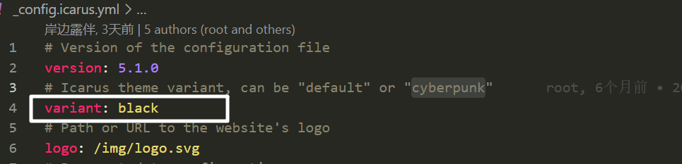
在你的主题文件中把variant 修改为black
字体配置h3
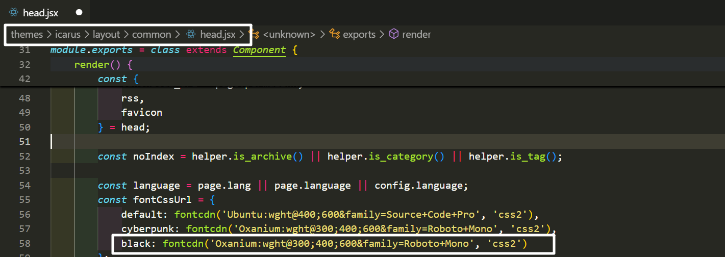
可加可不加
# 我这里直接用的cyberpunk的字体文件+ black: fontcdn('Oxanium:wght@300;400;600&family=Roboto+Mono', 'css2')